Posta Güvercini Brand Identity
An end-to-end brand identity for Posta Güvercini — a long-established Turkish bulk-messaging brand. I rebuilt the brand from scratch: replacing a multicolor, serif mark with a single-color navy system, then carrying it across every touchpoint, from the product UI to print and events. One language that has to hold from a tiny app icon to a stage-sized banner.
- (Role)
- Senior UI/UX Designer — solo, end-to-end
- (Duration)
- 1 month
- (Year)
- 2026
- (Scope)
- End-to-end identity system — logo, color & type, digital (web, app, dashboard) and print/merch

What was designed
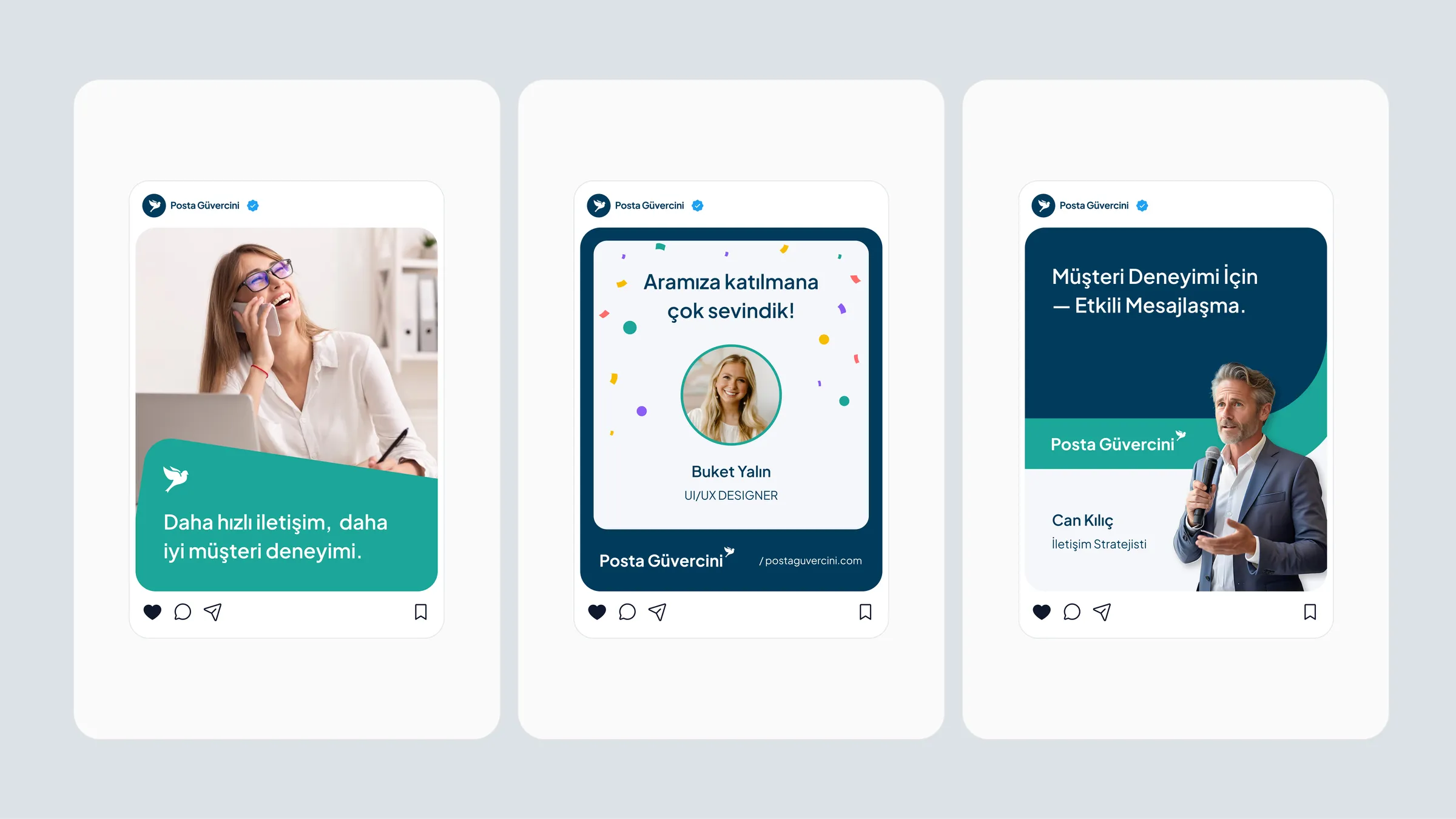
I designed the full identity system on my own — logo and wordmark, a refined single dove mark, a navy + teal palette and a typography system — then applied it everywhere: the website, the mobile app and the customer dashboard; print and physical (business cards, letterhead, signage, pens, notebooks, t-shirts); and presentation templates. The challenge was one mark and one set of rules that stay recognisable across wildly different surfaces without becoming rigid.
System value
The identity gives Posta Güvercini a single visual language across product, web and physical communication. Consistency lives in shared tokens and rules, not in each format being rebuilt from scratch — so the brand reads the same wherever it appears, and new material starts from the system instead of a blank page.
From scattered expression to one consistent identity
Brand usage, visual language and communication touchpoints are pulled into one coherent system — so Posta Güvercini reads the same wherever it appears.


An end-to-end brand identity for Posta Güvercini — a long-established Turkish bulk-messaging brand. I rebuilt the brand from scratch: replacing a multicolor, serif mark with a single-color navy system, then carrying it across every touchpoint, from the product UI to print and events. One language that has to hold from a tiny app icon to a stage-sized banner.
(06)
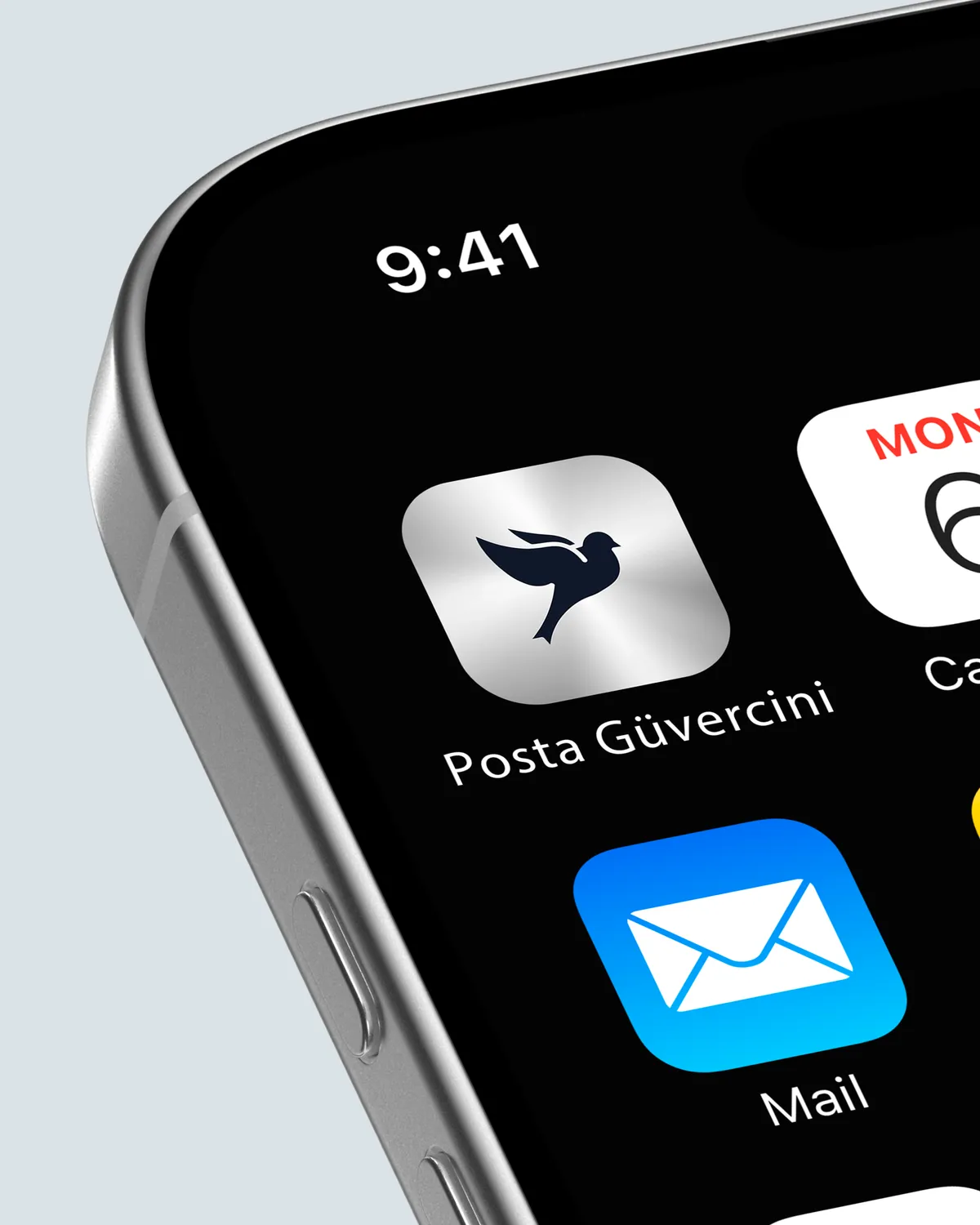
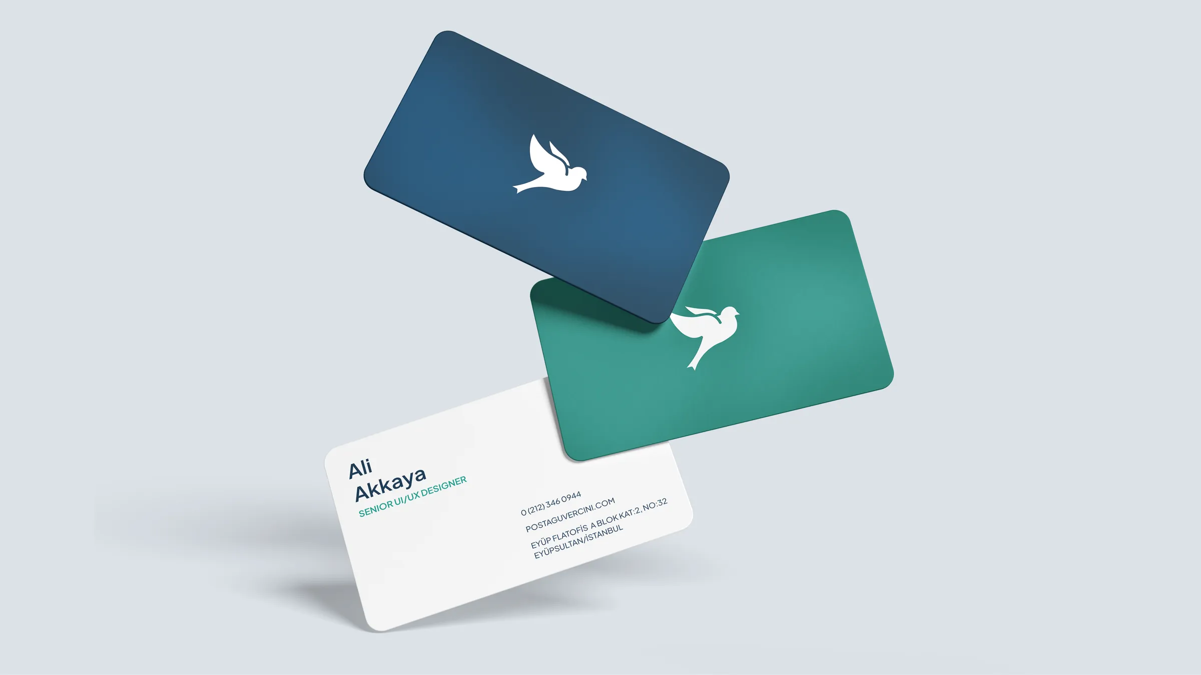
- 01Replaced the old multicolor (red/blue/yellow), serif mark with a single-color navy system and a clean sans-serif wordmark; reduced the dove to one fluid symbol.
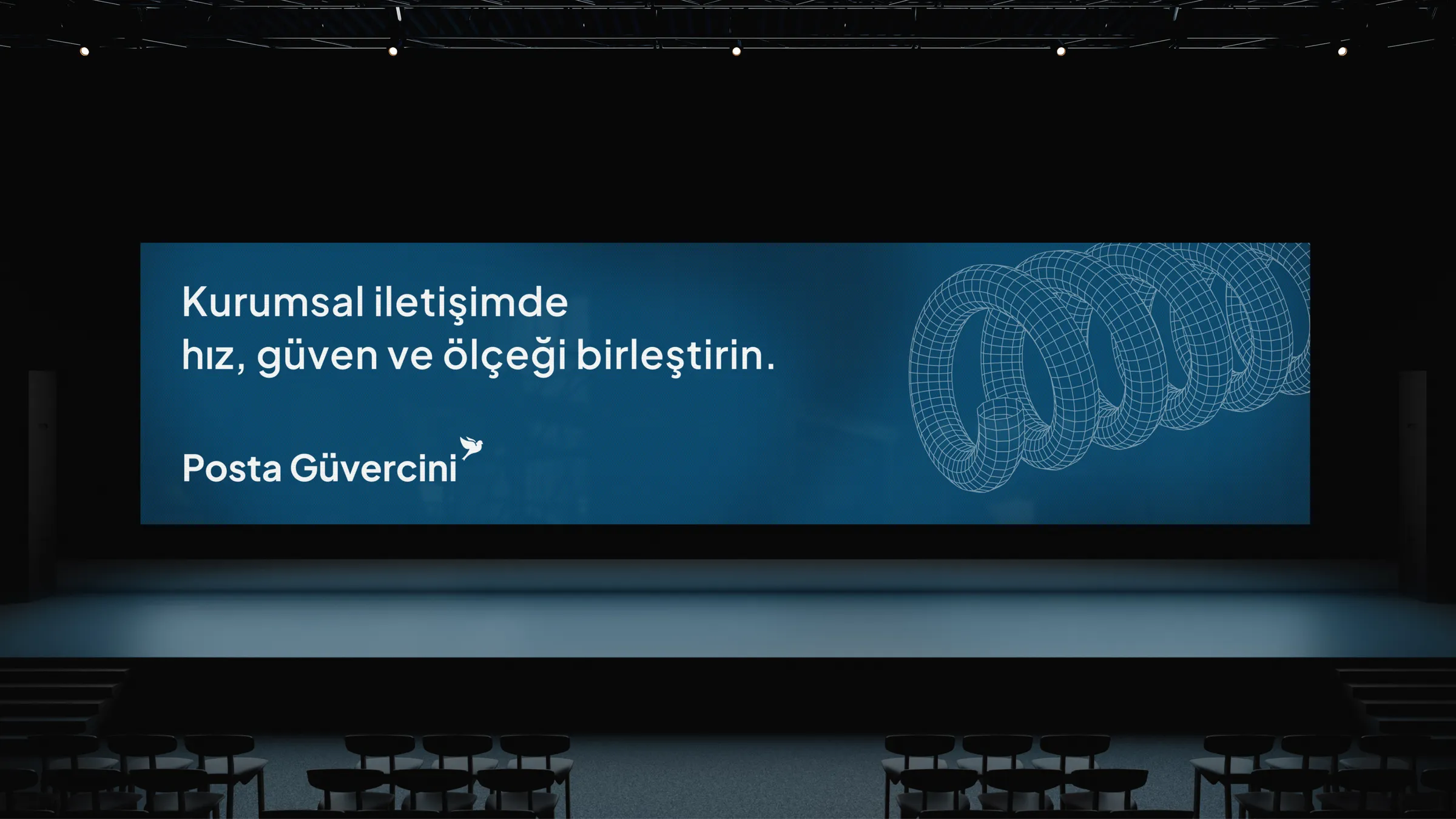
- 02Built navy + teal color tokens and one typography system — a base that scales without breaking, from an app icon to a stage-sized banner.
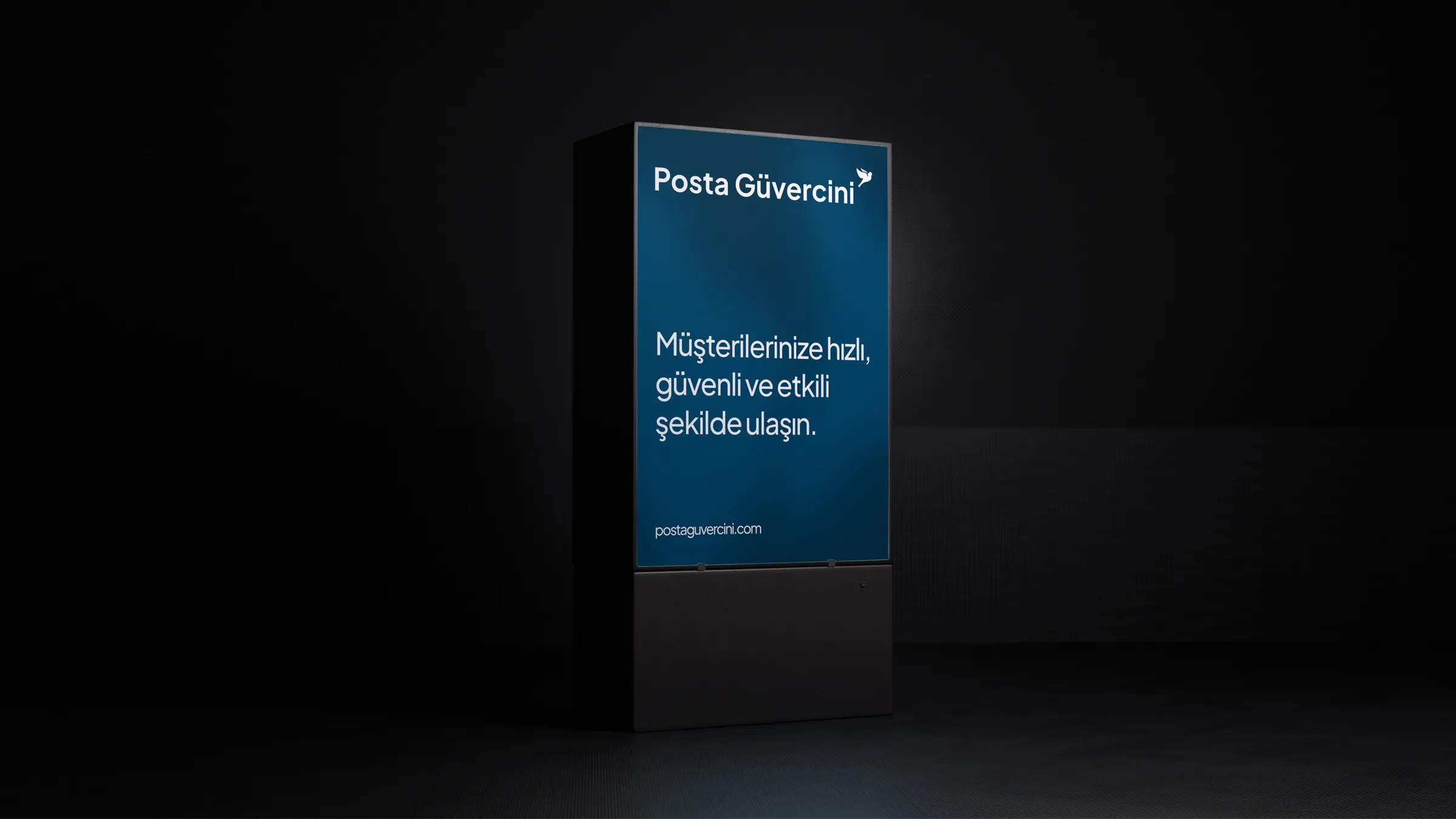
- 03Designed the system to apply from a single source across every touchpoint — web, app, dashboard, stationery, signage and merch.
The new identity became the brand's standard — every touchpoint, from logo to digital to print and events, now comes from this one system.
- 01One system end to end: logo, color and type through to the website, mobile app and customer dashboard.
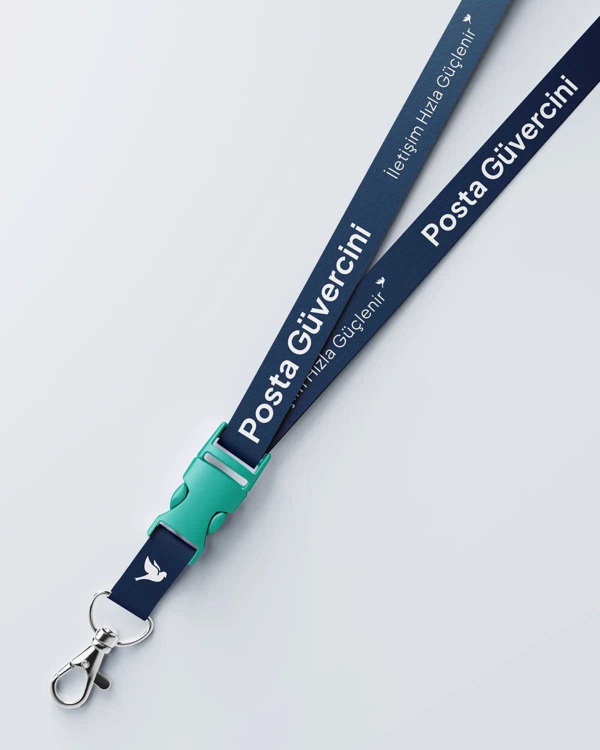
- 02Print and physical from the same language: business cards, letterhead, signage, pens, notebooks and t-shirts.
- 03Its most visible application is the new Posta Güvercini website (a separate case).
Final note
One brand system that holds together wherever it appears — on screen, in print, on stage.