Figensoft Website
A corporate website for Figensoft — one of Turkey's most established bulk-messaging brands — bringing a broad range of services, from messaging to payments, into one readable, trust-building structure. Built solo and from scratch as a system of reusable sections, not one-off pages — one that holds up as the company grows.
- (Role)
- Senior UI/UX Designer — solo, end-to-end
- (Duration)
- 1 month
- (Year)
- 2025
- (Scope)
- 50+ page corporate website (20+ products, 11 industry solutions)
- (Platform)
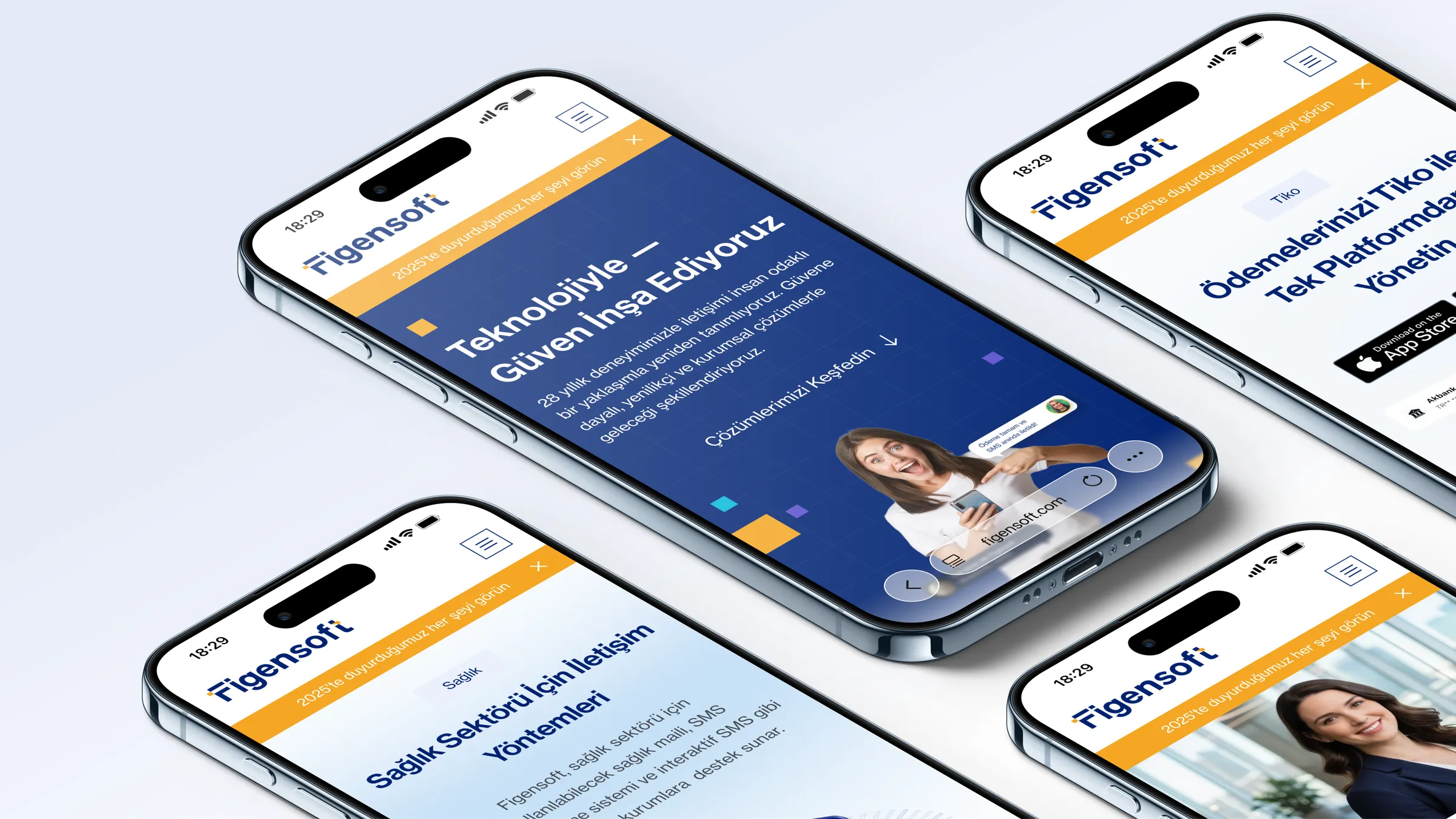
- Responsive web (desktop + mobile)
- (Live site)
- Open website

What was designed
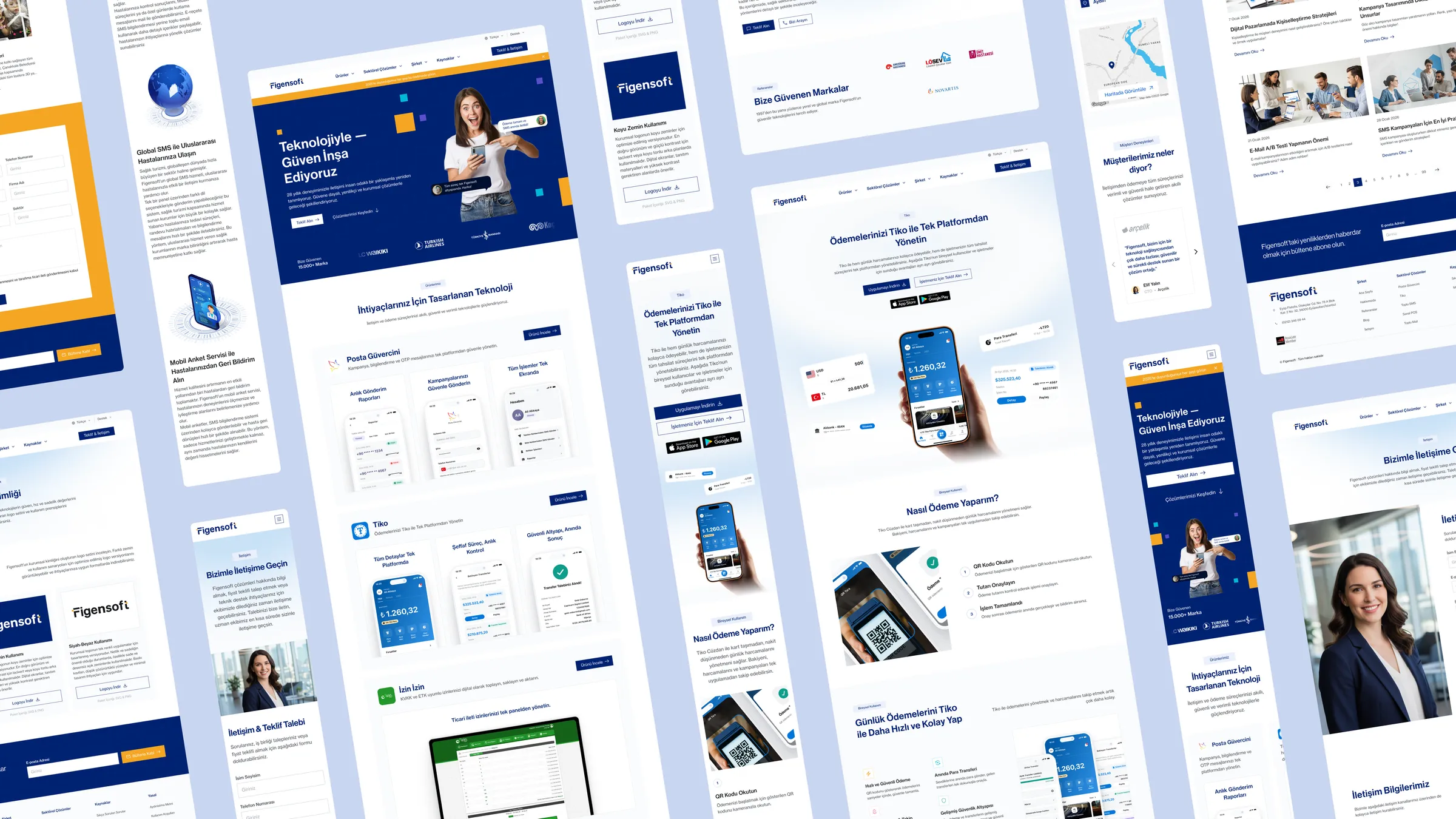
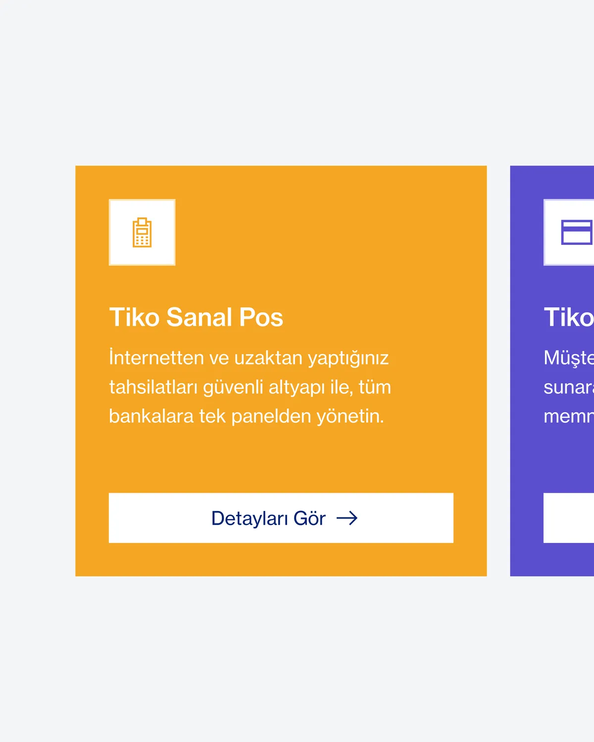
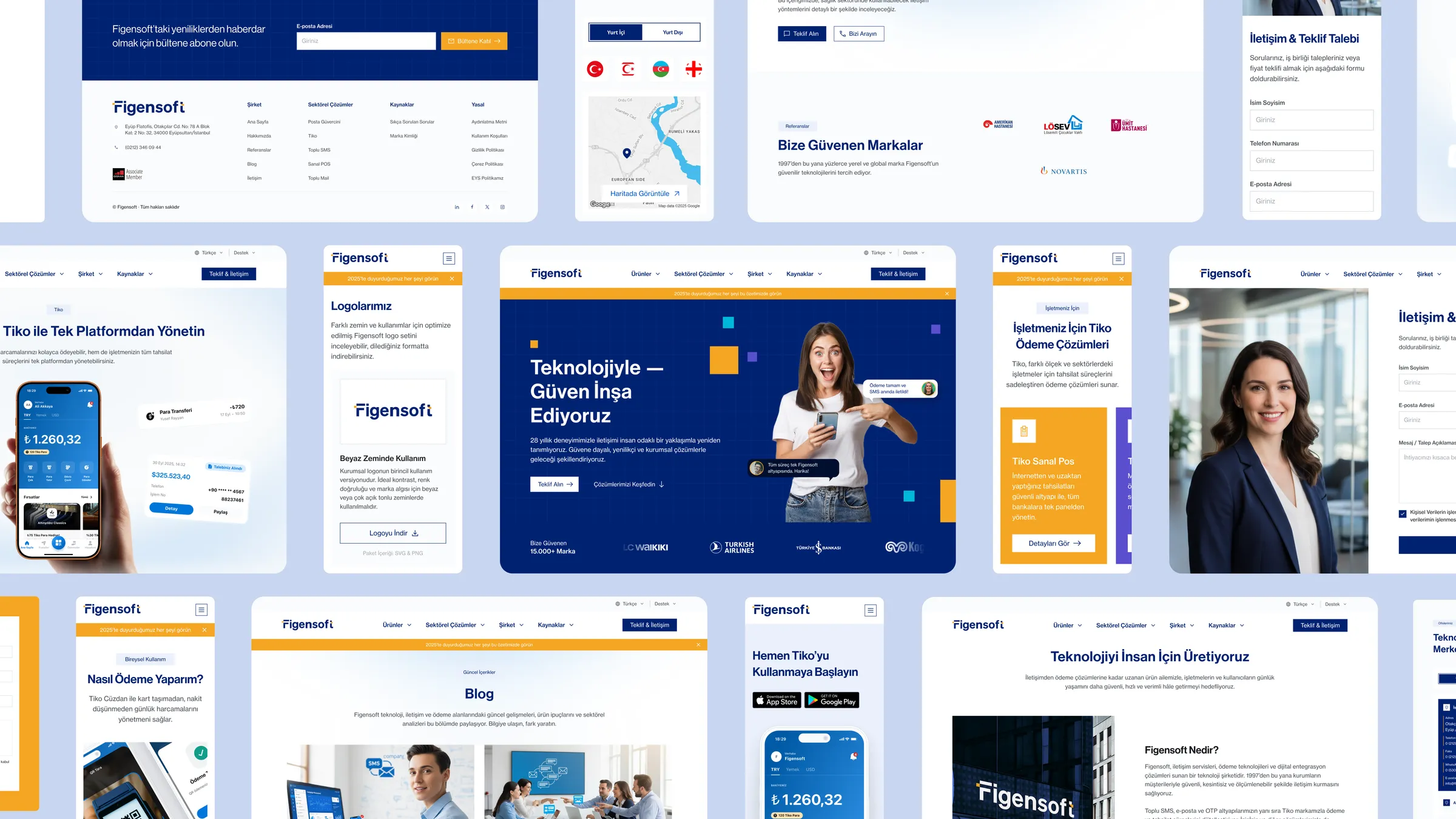
This site is the digital application of the Figensoft brand identity and design system I built from scratch beforehand (the identity work is a separate case study). I shaped the site's information architecture, product/service communication, and visual hierarchy. The core challenge: keeping many services — bulk messaging (SMS / mail / OTP), permission-based marketing (Turkey's İYS), and Tiko payment solutions (virtual POS, installments, links) — coherent and consistent across responsive layouts. On top of the design-system foundation I created (navy + amber color tokens, Neue Haas Grotesk typography), I designed 50+ reusable section components for the site and handed them off to development.
System value
A reusable section system gives the company a clearer way to tell its services across screen sizes, and to add or change sections over time. Consistency lives in shared components and tokens, not in individual pages — so the site is infrastructure that can grow, not the design of a single moment.
From service information to clearer product communication
The old site explained services through carousels and walls of text, with weak hierarchy. The new system carries the same content with stronger hierarchy, clearer navigation, and a consistent corporate voice — surfacing proof like "15,000+ brands" to make trust visible.


A corporate website for Figensoft — one of Turkey's most established bulk-messaging brands — bringing a broad range of services, from messaging to payments, into one readable, trust-building structure. Built solo and from scratch as a system of reusable sections, not one-off pages — one that holds up as the company grows.
(09)

- 01I defined the brand direction; after testing a more energetic blue alternative, I moved to a deep navy + amber system because it carried trust and corporate clarity more strongly.
- 02A section-based responsive system — reusable modules across breakpoints, not one-off pages.
- 03Service IA — 20+ products and 11 industry solutions, grouped under Products / Solutions / Company / Resources.
The system shipped live on figensoft.com and replaced the previous corporate website. A solo, from-scratch effort — handed off to development and now used as the company's web standard.
- 01Solo, from scratch: 50+ responsive pages (20+ products, 11 industry solutions, plus company/legal/resource pages), each in desktop + mobile.
- 02Faster page production — new pages are assembled from shared sections instead of being designed one by one.
- 03The system that started with the website became one of the main references for the corporate identity — from the logo to stationery use.
Final note
Designed as a system of reusable sections, not one-off pages. As screens multiply, the system scales — and the brand stays consistent from a single source.